Writer Wednesday: Don Simpson

Starting up my series of interviews with creative folks again, and branding it “Writer Wednesday,” although it won’t always be writers who are featured.

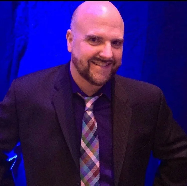
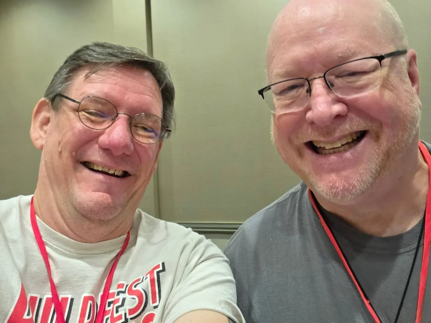
Today, I welcome my friend Don Simpson to the blog. After seeing Don’s work in comics dating back to the 80s, I got to know him in person through PulpFest, the annual pulp magazine and vintage paperback show held in Cranberry, PA each August (the 2027 show will be August 5-8). Over the past few years we’ve had plenty of great conversations about comics, creativity, and King Kong and so it felt right to re-inaugurate this series with a chat with Don.
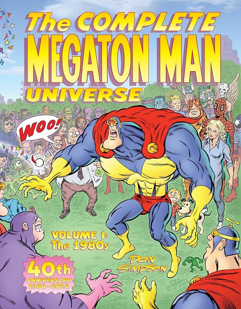
Don is probably most well known as the creator of Megaton Man, Border Worlds, and Bizarre Heroes. He also drew an adaptation of the original King Kong, and provided illustrations for Al Franken’s book Lies And The Lying Liars Who Tell Them. His recent releases include The Complete Megaton Man Universe Volume 1: The 1980s, Megaton Man; Microbus, The Lost Art of Don Simpson and X-Amount of Comics 1963: (When Else?!") Annual. Don can be found on Facebook, Instagram, his blog, Substack, and Bluesky.

Q: Hi Don! Thanks for taking some time to “chat” with me.

A: My pleasure, Anthony.

Q: I’m sure you’ve answered this question a million times, but for any of my readers who may not be familiar: how did Megaton Man come to be?

I was preparing to be a “serious” superhero penciler from the time I first started reading comics in the spring of 1972, at the age of ten. I read mostly Marvels at the time, and gravitated to undergrounds and Heavy Metal and European bandes dessinées by the time I was in the late teens and early twenties. Of course, I also always read the daily comic strips in The Detroit News and Peanuts and Funky Winkerbean, and of course Mad magazine and later National Lampoon and so on, so I was always a fan of humor as well. I would always draw funny comic strips for my school newspaper from time to time, and was featured on the choir bulletin board in high school. So I always had a sense of humor, I like to think.

So, like I say, I was submitting stories to Heavy Metal and getting rejection slips from (art director) John Workman, which were still encouraging, and rejections from Jim Shooter at Marvel and Dean Mullaney at Eclipse Comics. I wasn’t giving up on science fiction or superheroes, dramatic comics, as it were, but I also roomed with Mike Kazaleh, an aspiring humor cartoonists and animator—he later had success working for everyone from Ralph Bakshi on a Mighty Mouse revival to Matt Groening on the early Simpsons when it was on the Tracey Ullman show to John Kricfalusi on Ren and Stimpy. He would draw Ren and Stimpy for quite a long run at Marvel. Anyway, we were a couple of undiscovered geniuses getting nowhere in Detroit, and we shared an apartment where our drawing boards were in the kitchen.

One day we got to arguing about the relative difficulty of doing drama versus humor in cartooning, which is an absurd discussion to have—many of the greats were facile with both—Crumb, Kurtzman, Wally Wood, and so on. So we made this kind of friendly bet to try the opposite genre. Mike tried serious superheroes and gave up within a matter of hours; I tried doing funny stuff and it was just awful, but I kept at it. Finally, I drew the over-muscled beach bum with bikini-clad chicks draped all over his massive arms. I showed it to Mike and it was the first thing that got a laugh from him. I thought maybe I had something.

I kept at it and gave him a costume with a big “M” on his torso. I tossed around names with my other roommate, Brian Gabel, and one of us tossed out “Megaton Man,” and it just clicked. The whole concept sprang from that and it has really been a process of elaborating on it ever since.
Q: I’m always interested in the creative process. How do you approach page layout, lettering, etc. for a given project?

A: In the old days, I would start with a scribble in a sketchbook, a thumbnail rough, or maybe I would draw directly on 11" x 17" Bristol board. Today, I’m much more likely to type out a full script on a word processor. But I still can go back and forth. If it is a cover or a one-pager, and I can draw it all out in one sitting, I may just go with the inspiration. If it is a longer story, I’m going to type out plot notes, then start to hear dialogue, then add scenic (visual) descriptions. My full scripts can be quite elaborate—who is in the foreground, who is in the background, who is entering from the left side of the panel, and so on. I include psychological notes about the characters’ states of mind, if necessary.

I’m much more comfortable writing out my thoughts fully because I’ve learned if I have to set a project aside for any length of time, I can read back what I’ve written and recall my state of mind and what it is I want to draw. If I just make a scribble and then set it aside, if I don’t get to it right away, I have no idea how to decipher it later. And an unfinished drawing runs the risk of going stale. I used to draw every day so I ran into that less often. But as I’ve gotten older and life is more complicated, I find writing it out is better in case life intervenes and I can’t finish it all in a few days or weeks.

Sometimes the full-script approach leads to wordy dialogue, but it’s easier to cut dialogue at the drawing board—the fact that I still hand-letter is a big inducement to trim! And if a scene goes stale or no longer serves a purpose, I find it easier to cut writing than to cut finished art. It can be painful to have to cut finished comics pages that no longer serve any purpose in the story.

Q: What are your preferred tools for each step of your process (pencils, inks, letters, colors)? And have those preferences changed over the course of your career?

A: I’m still blue pencil—light blue Col-Erase, although they’ve discontinued them, the bastards—and graphite pencil, Hunt #102 crowquill and sable brush, Rapidographs for lettering, although pigment markers are more convenient nowadays. I scan my art into the computer and color in Photoshop. We used to use Cel-Vinyl colors on greylines—state-of-the art in the 1980s, but that is very primitive now.

Q: As a lifelong King Kong fan, I am particularly interested in how you came to work on the comic book adaptation and what that process was like.

A: I grew up with the movie on TV, of course. It was thrilling. It’s still thrilling today. The artistry really hasn’t been surpassed. The acting was atrocious, but the artistic vision, what is conveyed through stop-motion animation and set design and so on still holds tremendous power.

Fantagraphics approached me. I had done In Pictopia (from a script by Alan Moore) and Gary Groth was always fond of Border Worlds. I also know Tom Powers, a young guy from Detroit who became an assistant editor with Fantagraphics. Gary had been after the Kong license for quite some time—I’m sure you know the ownership of the Kong trademark and copyright—the film versus the screenplay and novelization—has long been a tangled mess.

They lined up six superstar covers by Dave Stevens, Al Williamson, Mark Schultz, William Stout, and Ken Steacy, and they needed someone cheap to do the adaptation and artwork. I was one-stop shopping, I suppose, and we agreed upon a page rate that wasn’t exactly Marvel or DC, but it compared favorably to Kitchen Sink Press, with whom I had just severed ties. So I got a used paperback copy of the Delos W. Lovelace novel—we didn’t have rights to use the RKO imagery, and I cartooned away.

It’s not a job I would have asked for or tried out for. I never thought I was doing the definitive interpretation of King Kong—just a workmanlike effort. I certainly put a lot into it. We were able to restore the giant spider scene and add a few other touches—I have a kid reading a Doc Savage novel in 1931, which is slightly anachronistic, but there you go. At the time it came out, my version didn’t get much love, but I think it has aged rather well. It has a fairly avid following now, especially at a venue like Pulpfest. I’ve sold several comics and a few pieces of original art there.

(Illustrator) Joe DeVito has had the Kong rights tied up for a long time and has refused to collect mine. I think Kong collectors would like to see the six issues collected into a mass-market graphic novel. I numbered all the pages from 1 to 130 for that purpose. Someday, Joe will be out of the picture and not be in a position to hold up the show anymore. I look forward to that.

Q: You’ve got two successful Kickstarters under your belt. Any advice for people looking to do a Kickstarter project? Things to do, and things to avoid?

A: Don’t cheat yourself on foreign postage. Not only are there customs—thank Emperor Tariff—but also filling out the forms is time-consuming. The big thing is not to overpromise and to fulfill promptly. Have your project already in the can and ready to send to the printer before you launch your campaign, and give yourself an extra three months. Also, don’t post pictures of the boxes being delivered, because then your backers will want to know why you haven’t mailed it out already, three days later. You’re not Amazon, so give yourself ample time.
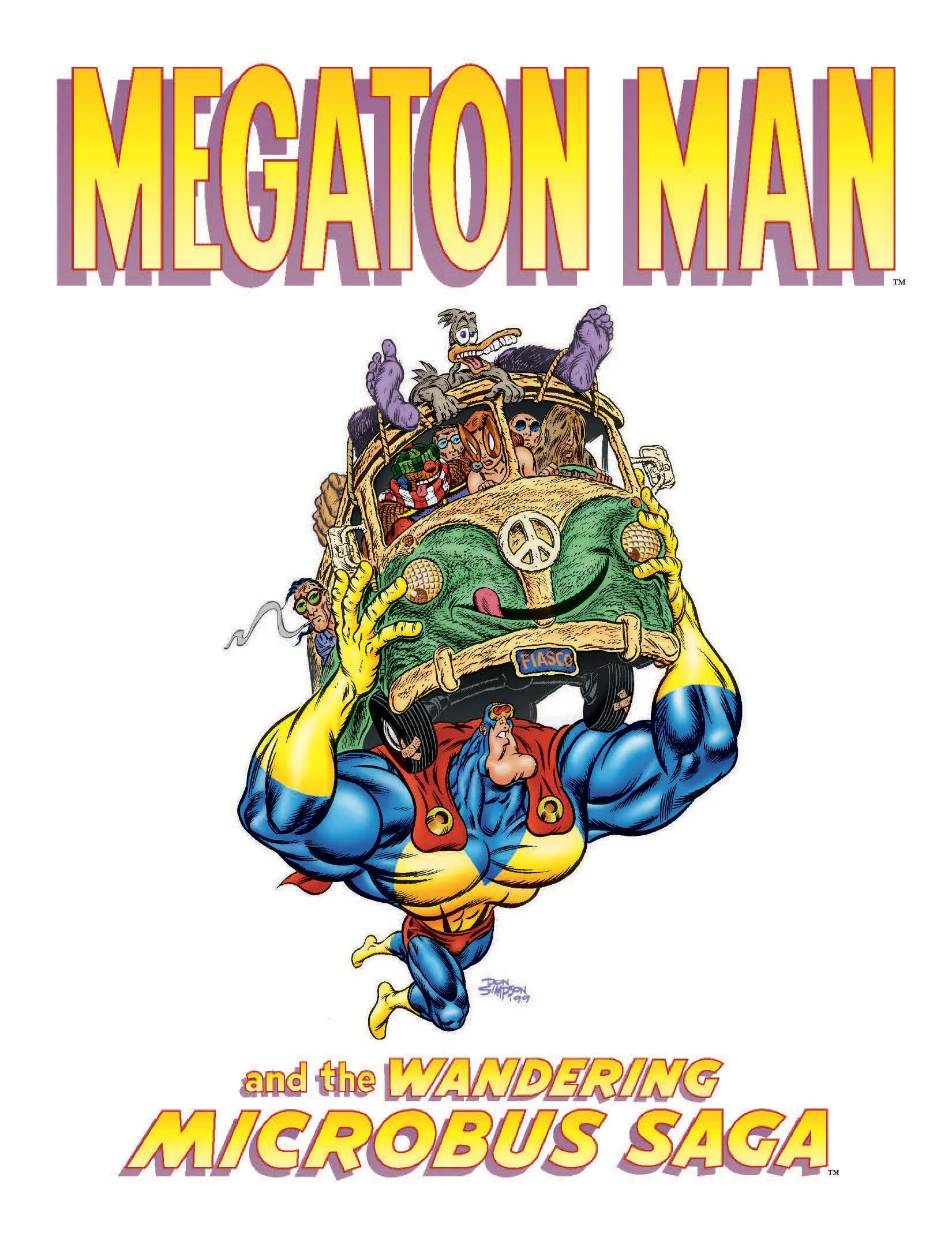
Q: Your most recent successful Kickstarter was for the Megaton Man: Microbus collection, which brought together all of the weekly Megaton Man serials from 1996 to 2001, plus some other material. And before that, you funded The Lost Art of Don Simpson. What’s your next Kickstarter project, and when does it launch?

A: I’ve been working on Megaton Man: Megatropolis, my “9/11” graphic novel, for twenty-five years. I’m finishing the coloring. I’m preparing to launch very shortly, I hope. Watch the skies!

Q: And my standard final question: What is your favorite book?

A: I prefer a lot of nonfiction. I’m not a voracious reader. I think I’ve read maybe twenty Doc Savages, back when I was a teenager. I’ve read one or two since, and they are tough sledding. But I’ve read the opening chapters to Doc Savage: His Apocalyptic Life, by Philip José Farmer, any number of times. For a while there, every spring I’d read the opening chapters, where he summarized the supersagas and talk about Henry Miller and E.E. “Doc” Eddison, and William S. Burroughs, and talk about telling a “rattling good story” and driving the literati up a wall. I found it thrilling and inspirational. More recently, I discovered the Barsoom trilogy of Edgar Rice Burroughs, which I think I prefer to Tarzan. There’s just something magical about A Princess of Mars—I bought the Library of America edition at Pulpfest this past summer. It’s just uncanny. It’s just words on paper, but I feel transported. I know people who are voracious readers and more widely read than I’ll ever be, but I’d rather read a few good examples of writing more than once. I’ve read Another Roadside Attraction by Tom Robbins twice, and it holds up. Henry Miller’s Tropic of Capricorn does not hold up, but the excerpts Farmer mentions in Apocalyptic Life are still thrilling.

A Catcher in the Rye is terribly dated now, and Wicked has to the most over-rated book in the past century.

Interview: Mark Wheatley

Today as part of my on-going series focused on the writers, artists, and publishers who will be appearing at Pulpfest this week, I chat with artist Mark Wheatley.

Mark Wheatley holds the Eisner, Inkpot, Golden Lion, Mucker, Gem and Speakeasy awards and nominations for the Harvey award and the Ignatz award. He is also an inductee to the Overstreet Hall of Fame. His work has often been included in the annual Spectrum selection of fantastic art and has appeared in private gallery shows, The Norman Rockwell Museum, Toledo Museum of Art, Huntington Art Museum, Fitchburg Art Museum, James A. Michener Art Museum, the Rice Gallery and the Library of Congress where several of his originals are in the LoC  permanent collection. He has designed for Lady Gaga, created set pieces for The Black Eyed Peas, contributed designs for ABC’s Beauty and the Beast, and Square Roots, as well as Super Clyde, The Millers and 2 Broke Girls on CBS. Several of his original graphic novels have been optioned for motion pictures and television. His most recent print projects include the Edgar Rice Burroughs Visions of Adventure portfolio, Songs of Giants, Doctor Cthulittle, Tarzan and the Dark Heart of Time, Swords Against the Moon Men, The Philip Jose Farmer Centennial Collection, Mine! and Wild Stars. Past creations include Return Of The Human, Ez Street, Lone Justice, Mars, Breathtaker, Black Hood, Prince Nightmare, Hammer Of The Gods, Blood Of The Innocent, Frankenstein Mobster, Miles The Monster, Skultar and Titanic Tales. His interpretations of established characters such as Tarzan, Dick Tracy, The Green Hornet, The Adventures Of Baron Munchausen, Jonny Quest, Dr. Strange, The Flash, Captain Action, Argus, The Spider, Stargate Atlantis, The Three Stooges, Doctor Who and Torchwood have brought them to life for a new generation of readers. He has written for TV, illustrated books, designed cutting-edge role-playing games, hosted a weekly radio program, and was an early innovator of the on-line daily comic strip form.


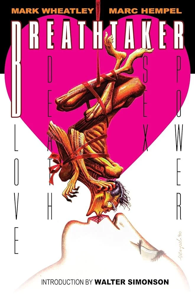
Your cult classic mini-series Breathtaker, co-created with Marc Hempel, is being remastered and released in trade paperback this fall, including some new material. I’d love to hear about the process of bringing it back, and of creating the new material.

It is hard to believe it has been 35 years since Breathtaker first saw print! Breathtaker was one of the very first creator-owned books to come out under the DC Comics banner—though it took some heavy lifting to make that possible. Our attorney, Richard Theibert, spent more than a year in negotiations with DC’s Lillian Laserson to hammer out a new kind of publishing agreement. What came out of those talks would eventually become the blueprint for creator-owned contracts at DC, opening the door for many others after us.

The series launched as a four-issue Prestige Format run and took off quickly, going into multiple reprints and even earning a Harvey Award nomination. It helped shine a light on both Marc Hempel’s work and mine—we were each honored with Inkpot Awards, thanks in large part to Breathtaker's success. When DC decided to collect the series, that edition made history as the first book to carry the new Vertigo imprint. Over the next ten years, it would go through seven printings.

We had big plans for a sequel—but after our editor, Mike Gold, moved on from DC, those plans stalled. Eventually, Marc and I got the rights back. For a moment, it looked like Breathtaker was headed to the big screen: Sony optioned the property, with Kate Hudson lined up to star. But as happens in Hollywood, a change in leadership at the studio sent the project into limbo.

Then something remarkable happened. In 2008, the Norman Rockwell Museum added Breathtaker to their touring LitGraphic exhibition, showcasing the book alongside work by Eisner, Crumb, and Ditko. That exhibit turned out to be their most attended show ever. Later, the Rockwell created a full-scale solo exhibition devoted to Breathtaker, which—after pandemic delays—finally opened at McDaniel College in 2022.

Back in 2014, Marc and I turned to Indiegogo to support a full remaster of the book. Titan Comics came on board as publisher, and we were ready to roll—until a series of curveballs hit: shifting distributors, a global pandemic, and multiple industry slowdowns. We even had the book on press in 2020 when the world came to a halt.

Ironically, every delay gave us time to go further and deeper with the material. What we’ve finally produced is not just a reissue but a definitive edition—a fully remastered Breathtaker with nearly 80 pages of bonus material. That includes a brand-new story, rare behind-the-scenes content, and an introduction by the legendary Walter Simonson.

Marc Hempel and I are good friends and we get to hang out and catch dinner on an irregular schedule. But we have not had any real opportunity or inclination to collaborate in decades. But this new edition of Breathtaker got us thinking about a cool new story featuring THE MAN.

MAKE WAY FOR THE MAN #138 is the in-universe comic book from Breathtaker brought to life. In the original story, The Man isn’t just a government super-agent—he’s also a full-blown media franchise. He’s got a TV show, video games, toys, branded apparel… and, yes, even his own long-running comic book. In one scene, a fan even asks him to sign a copy of MAKE WAY FOR THE MAN #137.

So to mark Breathtaker's 35th anniversary, Marc and I teamed up again—our first real collaboration in decades—to finally create issue #138. We thought: why not make it real? It’s our chance to explore the absurdity of The Man’s mythos from inside his own over-the-top world.

It’s a wild mix of slick spy action and tongue-in-cheek commentary—very James Bond, and very meta. We leaned into the fun, even spoofing those old Hostess snack cake ads with a custom parody strip starring The Man. This is a full comic, not just a throwaway extra.

And to top it off, we brought in the amazing Mike Oeming to create a special variant cover—his take on The Man is fantastic and adds another layer of cool to the project.

The book is already out in Germany and Spain. We’ve had the chance to hold the hardback Breathtaker in our hands! And having seen those editions, I can say with confidence: this is the version we always dreamed of making.

BREATHTAKER: Love, Death, Sex, Power will be on sale in the US on September 3rd.

Blood of the Innocent was my first exposure to your work and Marc Hempel’s. Is there any chance that we’ll get a nice trade paperback collected edition?

No current plans. But it is something that Marc, Rickey Shanklin and I would love to make happen.

What drew you to art? Who were your earliest artistic influences? And who inspires you currently?

Comic books introduced me to art. The earliest artist I could identify was Steve Ditko on Spider-Man. Then one day I discovered the Flash Gordon comics Al Williamson was drawing. Those comics had ads for the Nostalgia Press Flash Gordon collection by Alex Raymond. I got that for Christmas. Once I discovered Raymond, I was on track to discover all the classic Golden Age illustrators, starting with NC Wyeth! To this day, Wyeth is still my favorite artist. But I am inspired by everything! From impressionism to modern installations, music, film, audio recordings, all of it bubbles away in my head. And hey, the current Flash Gordon creator, ‪Dan Schkade is a new inspiration! Maybe I owe it all to Flash?

You’ve worked in many different mediums over the years. Do you have a favorite, a “go-to”? And has that changed over the course of your career?

For real media painting, my medium of choice is watercolor and gouache. I’ve been getting an increasing number of gigs for my line art. For that I use Japanese pens and brushes and ink. Zebra brush pens, Kuretake water brushes, and Sumi ink. For ink work, I prefer a hot press surface. Pencil works better for me if the surface has a tooth. But most of my painting now is digital, if only for schedules and to satisfy my clients who always want changes! But I’ve come to enjoy working digitally. And as my eyes get older, it is a real advantage to be able to enlarge area of a painting as I work! For digital, I have a Cintiq and I work in Photoshop, using my own custom brushes. To get the kind of detail, texture, and color subtlety I expect, most of my digital paintings are about 10’ tall at 300dpi. I offer museum quality giclee prints at conventions and signings, and you can easily see just how “real” my paintings actually are.

I absolutely love your painted work (the Doctor Who covers, the book covers for Meteor House and Edgar Rice Burroughs Inc, Doctor Cthulittle, the book of poetry by pulp-era writers (Songs of Giants), and so much more). I’d be interested to hear about your process of taking them from original concept to finished project.

I keep a sketch book. I generate ideas there. But often, too often, clients come to me with little lead time on the deadline. So, I take as much time as I can to research the piece. This means I spend, sometimes, days scouring the internet, searching for photos, videos, anything that gives me some accurate reference for what I am expected to create. Then, depending on the budget, if there is money for roughs, I come up with some basic ideas, compositions. If approved, I move to working up the final piece. If there is time (there never is) I will sketch some figures. Not a full composition, but some of the pieces of the image. Working out emotions, impressions. When I have something that I’m happy with, I will turn that into a full drawing, maybe taking it to an inked piece. I’ll scan that and start painting. But more often than not, there is no time or budget. And I go from making a few sketches to drawing on the Cintiq, right in Photoshop and the image forms in the fastest way I can manage. Gradually drifting from sloppy, chunky bits, pieces I’m cutting and pasting and distorting until it starts to work for me.

Usually, when I begin a new painting, there is a moment when I think, “Hey this time I think I finally have an amazing piece developing!” Then a few hours later I think, “I can’t draw. I can’t paint! Why do I even try?” But I keep at it, getting rid of anything that offends me, until I finally think, “Maybe I can make this work. It won’t be too bad.”  I work on it longer, and finally a moment comes after I’ve been staring at the painting for a long time and have not seen anything I can do to it. And it is done.

 This is going to be weird to say, but I’m always sort of happy when I hear that even the professionals whose work I love have those moments of doubt during the process of creation. Thanks for sharing that.

Finally, do you have anything in the works you’d like folks to know about?

I’ve got a couple of major projects underway that I can’t talk about just yet—NDAs and all that—but what I can say is that I’m especially excited for people to finally get their hands on the new edition of Breathtaker. It’s been a long time coming, and this is the most complete version we’ve ever done. There are some fantastic events tied to the release, especially at Baltimore Comic-Con this October.

Before that, we’re kicking things off with a launch party on September 6th at Beyond Comics in Frederick, Maryland. It’s a great space, and we’re expecting a big crowd—so if you’re anywhere nearby, definitely come by. Marc Hempel and I will be there, and it’s shaping up to be a really fun celebration.

In the studio, I’ve been deep into work on The Land That Time Forgot for ERB Books. I’ve painted the cover for the first volume and I’m working on a number of interior illustrations now. I’m also illustrating a new book by my Doctor Cthulittle collaborator, G. D. Falksen—it’s been a fantastic collaboration. And I’m continuing to contribute covers for the Robert E. Howard Foundation’s Ultimate series, which has been a real honor.

Next on the calendar is PulpFest, where I’ll be giving a presentation with Doug Klauba on the “Masters of Tarzan Illustration.” I’m really looking forward to it—it’s always a great chance to connect with people who love this material as much as I do.

Thanks again for taking the time to chat, Mark! See you in just a few days at Pulpfest! And readers, don’t forget you can see more of Mark’s work on the Mark Wheatley Gallery website!


Readers, it is not too late to register for and attend Pulpfest 2025 (THE pulp magazine-focused convention in the Northeast) and the other three conventions it hosts: FarmerCon (dedicated to the works of Philip Jose Farmer), ERBFest (dedicated to the works of Edgar Rice Burroughs) and DocCon (dedicated to all things Doc Savage related). Check out the Pulpfest website for registration and hotel information!

PRIDE 2020 INTERVIEWS: Steve Cummings

Today’s PRIDE 2020 Interview is with artist Steve Cummings.

101134821_2876119592499280_4989098869334736896_n.jpg


Hi Steve! Hope you’re staying well during the current pandemic lockdown. What are you doing to stay creatively motivated during these unusual times? 

There are definitely pros to social distancing during this pandemic if you are a creative person.  I am immersing myself in several TV shows that have been on my radar to check out, most notably ‘The Marvelous Mrs. Maisel,’ whose period decor and Beatnik bar inspired my newest art piece. Lately I’ve been drawn to watching classic or ‘cult’ melodramas from the 1950s-1970s that were aimed primarily for women (or gay men), as well as 1970s horror films with an occult slant. For music I’ve been listening to a lot of West Coast Jazz, 1960s Bossa Nova and lounge music.  Curiously, as usual, the work of current exhibiting fine artists has had no influence.  Recently I’ve been drawn to some of David Hockney’s paintings, and Edward Hopper always inspires me, yet music and films have sparked ideas and themes more than the work of other visual artists.


Since June is Pride Month, I have to ask: how does being gay influence or inform your work?

Being gay has definitely informed my work over the years in several ways.  In addition to identifying as gay I also identify as ‘two-spirit’ and ‘Queer.’  As a two-spirit I believe you can look at all of the characters I’ve portrayed in my images and you’ll see me in all of them, both the males and the females - my complicated sexuality, my repressed desires, and my identification with being (at times) victimized, misunderstood, oppressed or liberated through rebellion. People say that the eyes of my characters say so much, and I agree.  There are equal amounts of vulnerability, fragility and perseverance in those eyes.  I believe that having a Queer sensibility ultimately gives you an enormous capacity for empathy and identification with the journeys of marginalized people (either due to race, class or sexual orientation).  In my art my characters are repeatedly in the process of being ‘caught’ in a moment - and that moment is often one of self-reflection or enlightenment.


I’m always interested in hearing about creative people’s processes. Can you walk us through the inspiration and process for your latest work?

Most of my inspiration for my images come from the journeys and experiences of individuals I refer to as ‘The Other,’ people who exist on the margins or fringes of conventional society. Many of my creations will show one or two characters in their perceived feelings of isolation or panic amid their surroundings.  Many of my environments evoke the past.  I’m drawn to Bohemian culture (and counter-culture), Mid-Century modern America in the 1950s through the 1970s, the hedonistic Disco era, carnival life, the Occult and the Great Depression. I also love vintage photos showing LGBT couples pre-1970s, when their lives were closeted from general society.  Over the past two years, I’ve been much more interested in portraying what I call ‘women on the verge’ - ladies (or transgender individuals) who are either heading toward a nervous breakdown, a psychic transformation, or a personal liberation.  I usually get a preliminary image in my head as to what the finished artwork will look like, and of course, this visual model will be tweaked and reworked and changed when I actually do the creating.  I’m primarily inspired by books, music, and films - especially those with a prevalent and bold visual language and a dynamic sense of color. In my latest piece, ‘Bossa Nova Beatnik,’ I married two passions of mine - Brazilian jazz and rebellious women from mid-century America - into a personal ‘snapshot’ of a gal (either alone in her house or hosting a party) dancing to one of her Stan Getz samba records.  Her eyes express vulnerability and a wide open hunger to seize her life on her own terms; her dress and body language express a defiance and possibly a future LGBT / Women’s Rights advocate.

Steve Cummings art.jpg


Do you work on multiple projects at a time, or do you concentrate on one piece to completion?

Usually I concentrate on one piece to completion.  I work digitally now, on my Apple iPad, using the Procreate APP with my Apple Pencil.  It normally take me several weeks to complete a new work.


Where can interested people find your work online/what are your social media accounts? 

My artwork can be seen on my website: www.s-cummingsart.com, on Facebook under Stevie Artiste or Art For the Wild At Heart, and on Instagram under auteur4489 or stevecummingsart.


Steve Cummings was born in Orange, NJ in 1968 and raised in West Orange.  In 2001 he moved to Keyport, NJ where he currently resides. He’s been drawing and painting since Kindergarten and studied art throughout high school, attended college at Montclair State College and received a BA in Fine Arts in 1992.  Two years later he returned to Montclair State (University) and earned a Post BA degree in Art Education. Since the early 1990s Steve has exhibited in various galleries throughout NJ, including (most recently) La Vie Galerie in Livingston, the QSpot LGBT Center in Ocean Grove, Kiss My Art Gallery in Asbury Park, Gallery U in Westfield, Trinity in Keyport, Rockpaperscissors in Asbury Park, and various exhibits at the Mitchell Sanborn Gallery in Keyport, and Lena DiGangi Gallery and Studio in Totowa.